TerrTerra - Web
TerrTerra is a fictional camping supplies retailer looking to begin selling their products online. As part of their initial e-commerce plans, they wanted an app for their target audience to purchase their products from.
This is project 1 of the Google UX Design Professional Certificate.
̌

TerrTerra is a fictional camping supplies retailer looking to begin selling their products online. The second phase of their business plan was to have an e-commerce website to sell their products to consumers.
This is project 2 of the Google UX Design Professional Certificate.
My role
UX/UI design, user research, prototyping, usability testing
Duration
40 hours (May 2024 - July 2024)
Tools used
Figma, Adobe Photoshop, Google, Zoom
Project overview
Challenge
Following TerrTerra’s app development, the brand needed a responsive website, across devices of all screen sizes, for their users to browse their products on.
Solution
Use research and learnings from the TerrTerra app development to apply to this second phase
Develop an e-commerce responsive website that reflects the look and usability of the app
Research
As this was a continuation of project 1, the TerrTerra mobile app, I was able to use the data and learnings from the research I conducted already. Naturally, I also used the user feedback from the app development to improve on the ideas when creating the responsive website design.
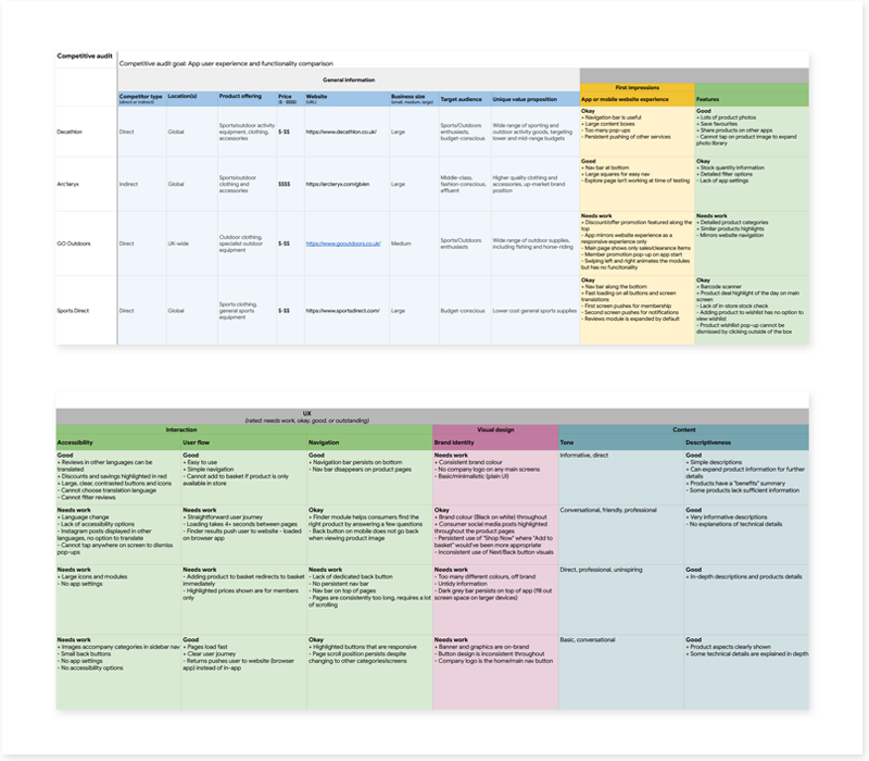
Competitive analysis
TerrTerra’s competitors designed their responsive websites to be similar to their app offering, as part of the 4 C’s: Consistency and Continuity. This works great as it helps build a strong brand image across devices and platforms, and also benefits users that switch devices to continue browsing or to complete their purchase.
I noticed that imagery and visuals were a key design choice for the competitors in this industry; both the large screen and small screen responsive designs of these websites feature large hero images and product images even when moving between screen sizes. Their design priority is on product focus, and while it means more scrolling for the user, it is most likely a worthwhile trade-off.
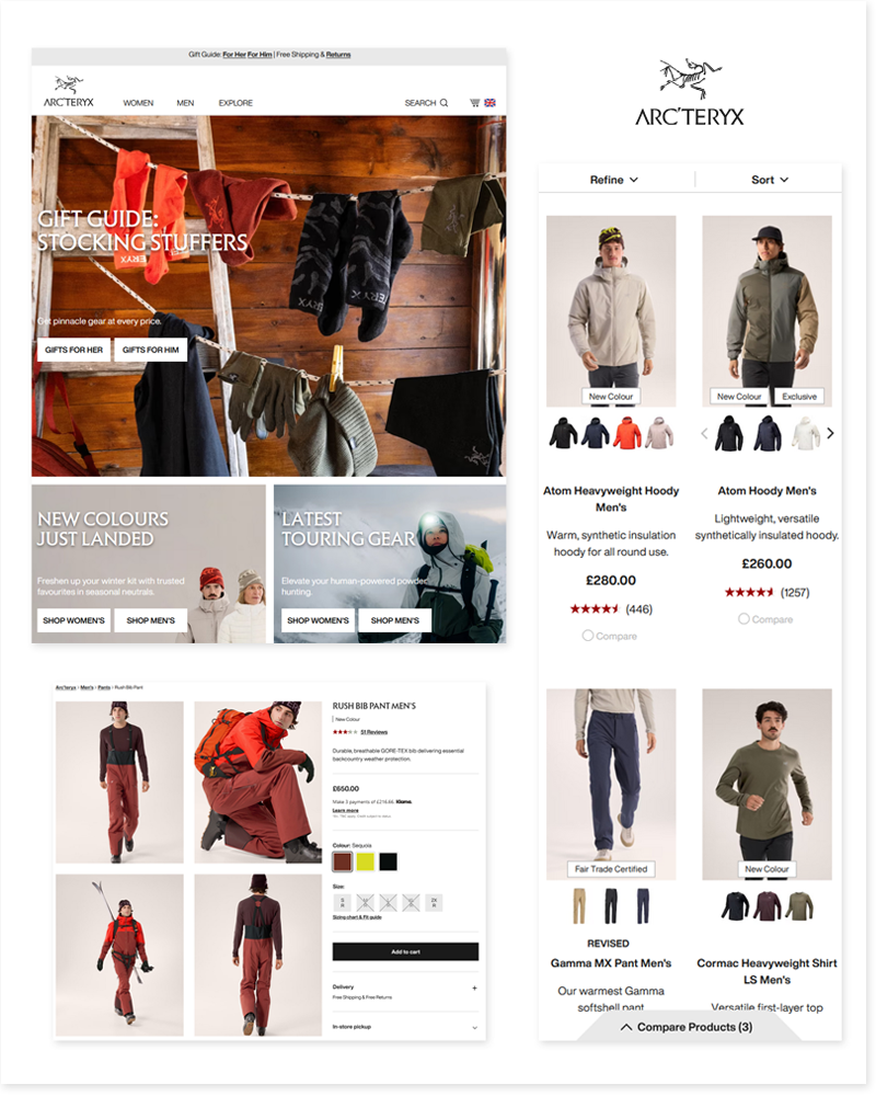

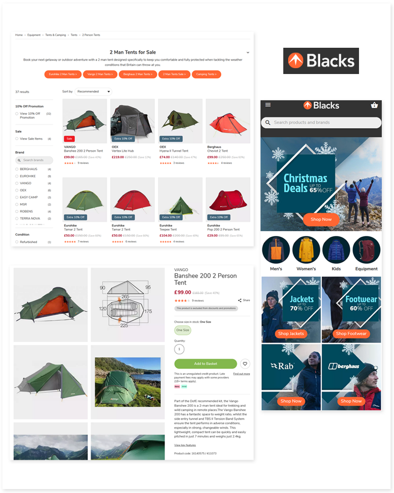
The following competitive audit analyses the main competitors’ website design and overall UX experience. I noted the aspects that worked well, and what didn’t, to guide my choices for TerrTerra’s responsive designs.
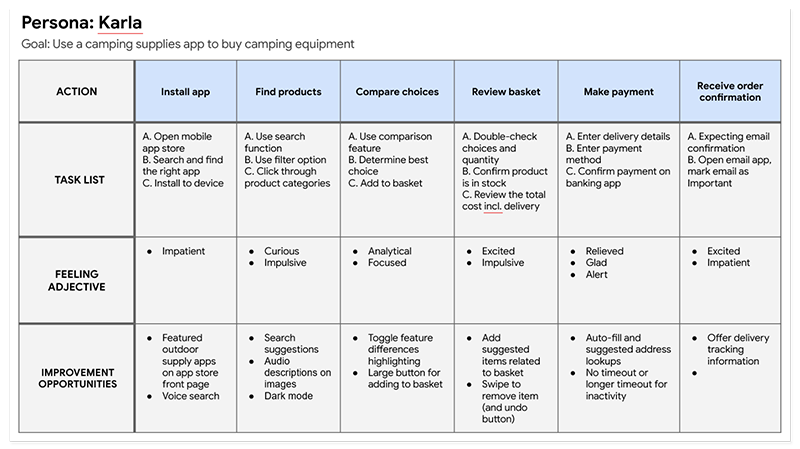
User persona
Karla helped to steer my design choices throughout the design process, as she did in the app development stage. I kept her goals and frustrations in mind for the responsive website design as I progressed.

Define & Ideate
In this section, I have added the Define phase information from TerrTerra’s app development, as it is relevant for the responsive website development.
User journey map
Problem statement
Karla is an outgoing artist who needs more information on which camping supplies to buy because she is fairly new to camping and would like to purchase suitable camping equipment.
Goal statement
The TerrTerra app will let users find the right camping products for them, which will affect those new to camping by presenting product information in a succinct manner and letting them compare products to better inform their purchasing decision. I will measure effectiveness through customer ratings and reviews of the app.
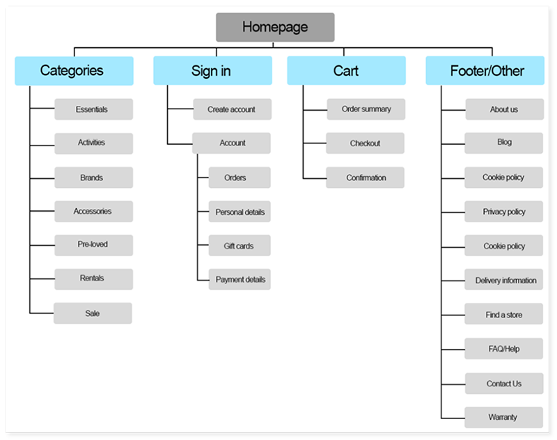
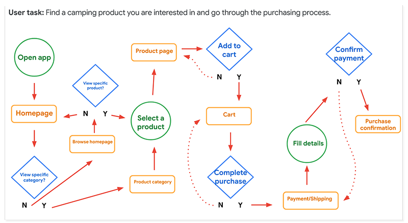
Information architecture
Site map
User flow
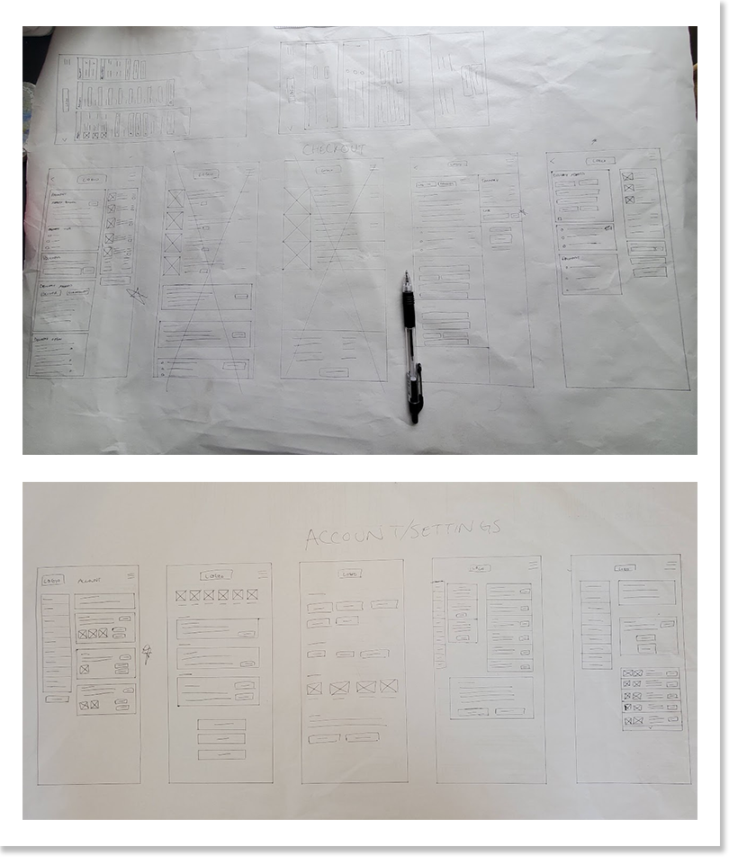
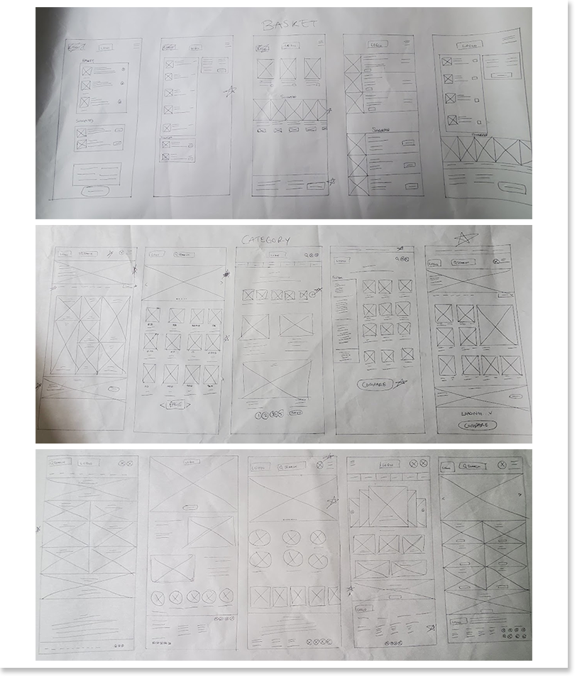
Lo-fi wireframes
I sketched and drafted initial designs for the responsive website, selecting what I felt were the best options before moving onto digital wireframes.
Prototype & Test
From the paper wireframes, I progressed to lo-fi digital wireframes and planned a usability test to get user feedback from participants to improve the user experience.
Lo-fi digital wireframe and prototype
As in TerrTerra’s app development, I focused on designing the screens for the main user flow. I worked on the responsive design for both the large and small screen together to ensure the visuals and accessibility considerations were consistent throughout.
View the TerrTerra (responsive - small screen) lo-fi digital prototype here.
View the TerrTerra (responsive - large screen) lo-fi digital prototype here.
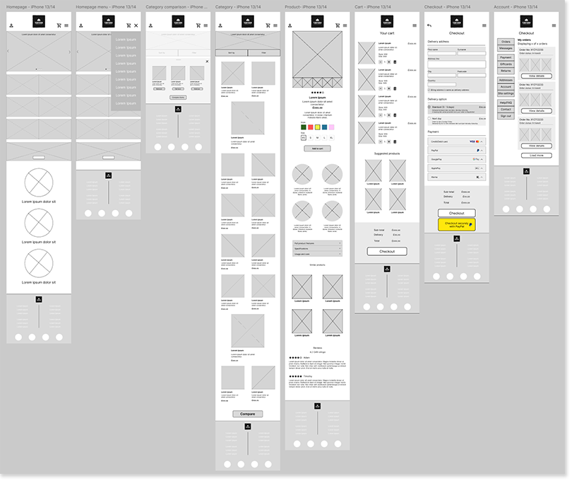
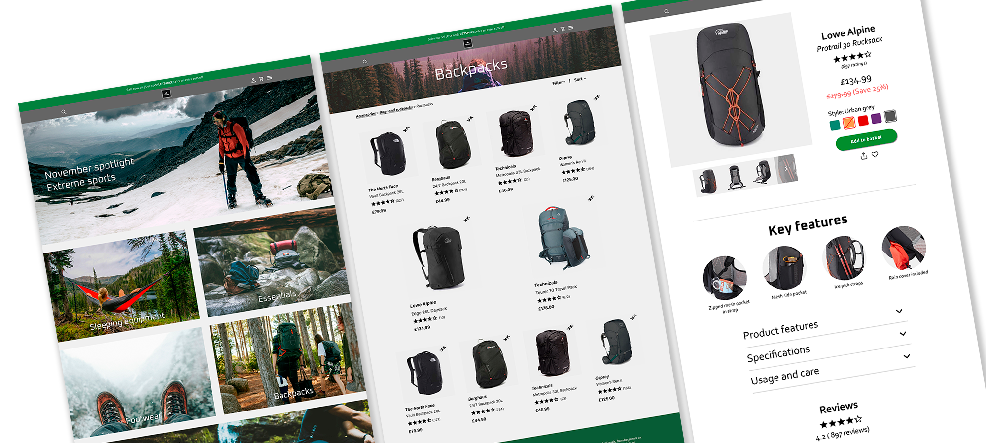
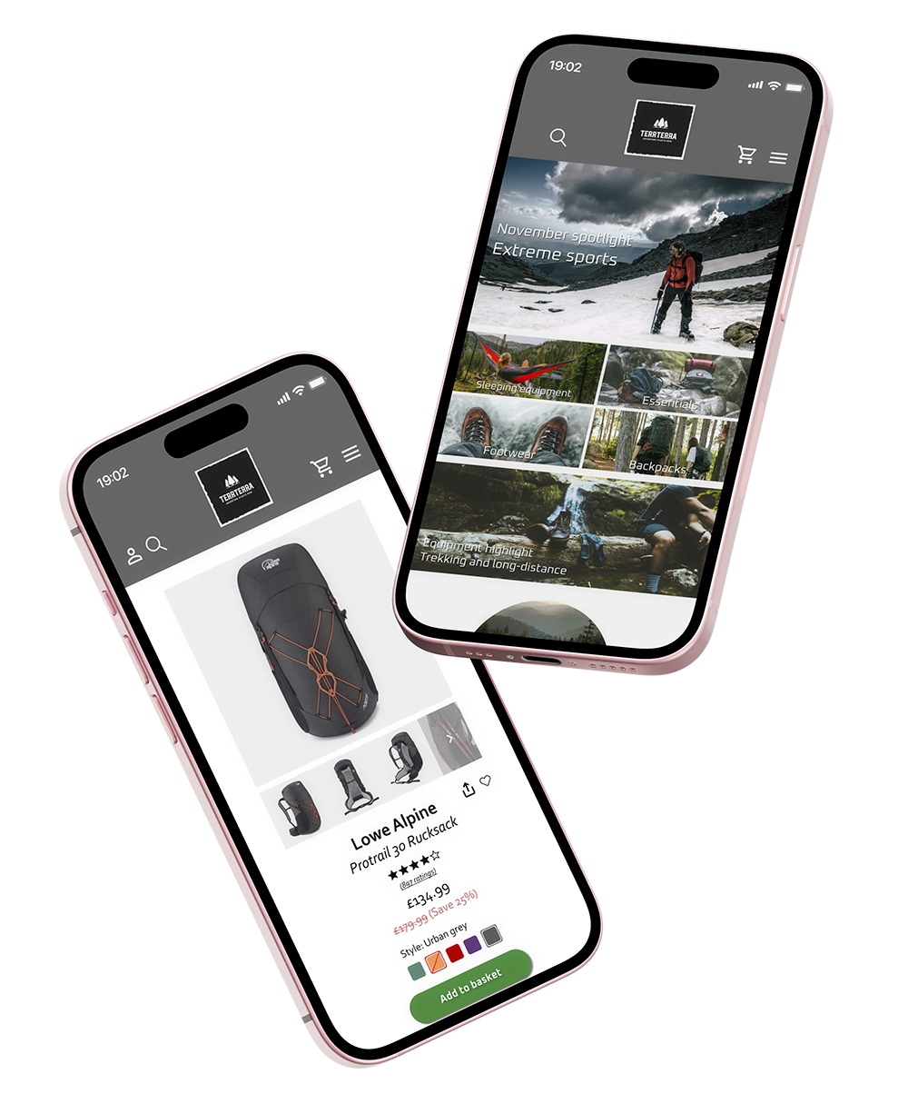
TerrTerra - Responsive (small screen) digital wireframes
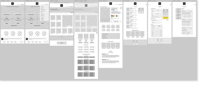
TerrTerra - Responsive (large screen) digital wireframes
Usability test
I re-used most of the same prompts from the TerrTerra app usability test with another group of 5 participants. During each of the tasks, the participants were asked if they experienced any difficulties and were encouraged to share any additional feedback they had regarding that particular task.
Test goals:
Gather feedback on the comparison feature and whether it helped purchase decisions
Ease of use for browsing, adding a product to cart, purchase process, expected outcomes
Evaluate user performance and identify pain points
Tasks:
Navigate from the home screen to a product category, then to a product of your choice
Compare this product with any other product
Add any product to the cart and complete the checkout process

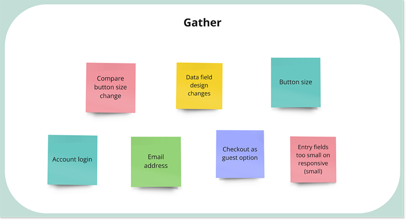
Test result example from a participant
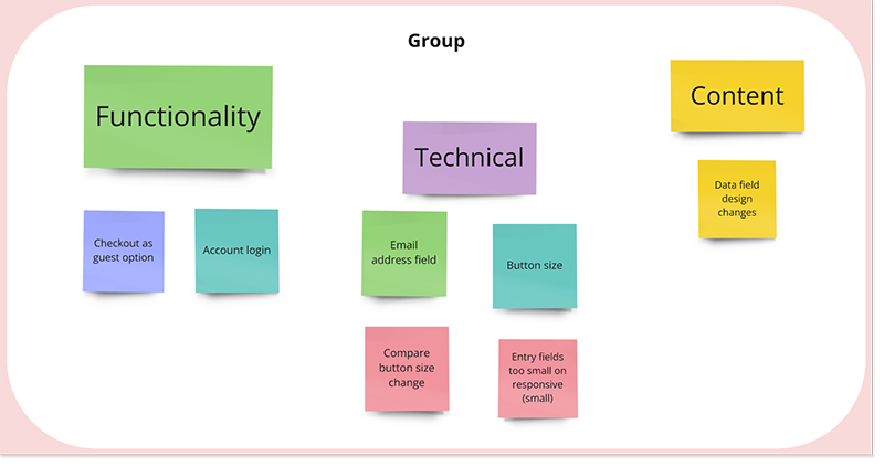
I put the results into an affinity map to sort and categorise the feedback, before selecting the highest priority changes to implement for the high-fidelity prototype.
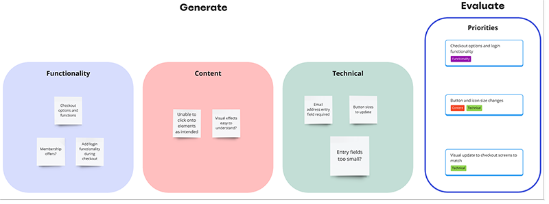
The priorities from the feedback that came out were as follows:
Users want to log into an existing account during the checkout phase
Users found it difficult to interact with some icons and buttons due to the small size
Users felt the look of the checkout screens didn’t match the rest of the website pages well
I ensured that I would prioritise these changes when moving onto the high-fidelity design.
Style guide
I re-used the assets from the responsive app design so that the design would be consistent, but updated some assets that changed in this responsive design, such as the button variants.

Hi-fi wireframes and prototype
I created the responsive design for small screens with a full working prototype intended for user testing thereafter, and made some designs for the large screen version as a proof of concept. As I designed with a mobile-first approach, I wanted to gather useful data from future testing before proceeding with the full work on the larger screen responsive variant.
Several accessibility considerations were made throughout, including but not limited to:
The visual design and components are placed in a specific order for the user to easily understand the information hierarchy on the screen
Gestalt principles are followed closely, to create clear sections and groups on all screens, thereby reducing confusion for the user in navigating and using the site
Text on the images are intended to be readable by screen readers through alt text
View the TerrTerra (responsive - small screen) hi-fi digital prototype here.

Furthermore, I made several design alterations as I reiterated on the high-fidelity wireframes, looking at what worked well and what didn’t. Some examples are shown below:
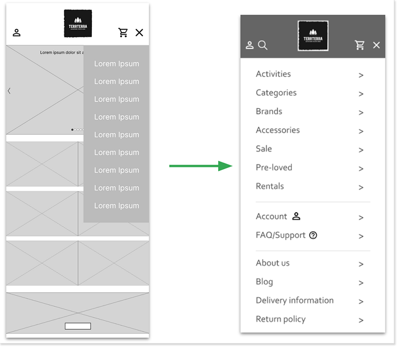
The initial design for the menu was smaller and kept the screen’s components in view. I changed this to a full screen menu as I felt it would be better for those with visual impairments and makes it easier to press on menu options on a smaller screen.
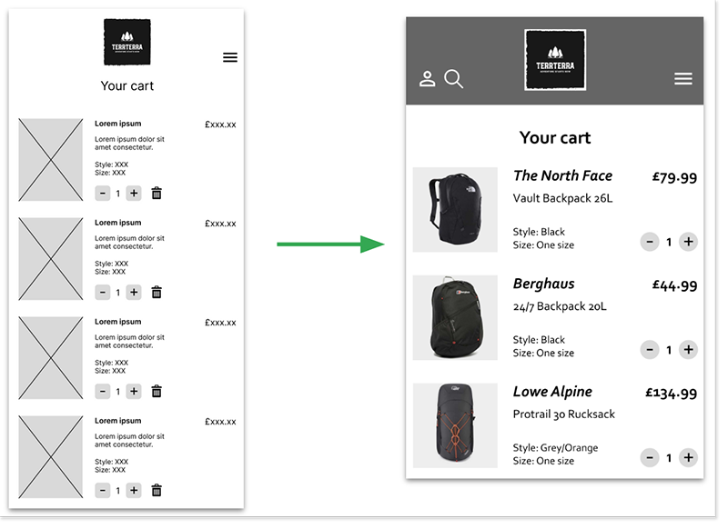
The preliminary design in the cart screen was updated with smaller thumbnails, removal of the unnecessary bin icon, and had suggested products based on the items in the cart further down the screen.
Review and next steps
This second project from the Google UX Design course taught me to research responsive sites in greater depth, understanding how elements, components, and assets change to suit the device that is being used. I learned a lot about changing layouts and enjoyed solving the issues around adapting designs for the user’s needs.
Next steps
As for the next steps, if I were to advance this project further, I would do the following:
Hold a usability test for the responsive small screen hi-fi prototype to get feedback on changes and understand how to proceed with the responsive large screen design
Investigate additional ways to enhance usability for those with accessibility requirements, including how to help users easily identify and interact with various buttons and icons on the screens