PetRecon
TerrTerra is a fictional camping supplies retailer looking to begin selling their products online. As part of their initial e-commerce plans, they wanted an app for their target audience to purchase their products from.
This is project 1 of the Google UX Design Professional Certificate.
̌
PetRecon was created as an app for social good. It is a conceptual platform intended to help the pet owners reunite with their missing pets and connect with their local community.
This is project 3 of the Google UX Design Professional Certificate.
My role
UX/UI design, user research, prototyping, usability testing
Duration
80 hours (September 2024 - November 2024)
Tools used
Figma, Adobe Photoshop, Google, Zoom
Project overview
Challenge
Pet owners in my local area regularly post flyers and knock on doors to ask neighbours about their missing pets. The challenge is that neighbours are not familiar with one another, leading to a lack of familiarity, social interaction, and even not knowing whether they own pets. This makes it difficult for announcing lost pets or reporting a sighting of one.
Solution
Create a multi-device platform that allows pet owners to report their missing pets, or neighbours to report a sighting
Report listings to browse and apply various filters for search purposes
A map feature to search by area specified
Design process
Empathise
Research
Given the prevalence of missing pet platforms, I anticipated finding similar websites and apps that offered solutions to reunite lost pets with their owners. To better understand how to begin with PetRecon, I set out the following goals:
Find and analyse similar missing pet platforms
Perform a competitive analysis and consider their strengths and weaknesses
Compare the user experience on competitor website and apps
Identify PetRecon’s target audience
Understand pet owners’ goals and frustrations when their pets go missing
Competitive analysis
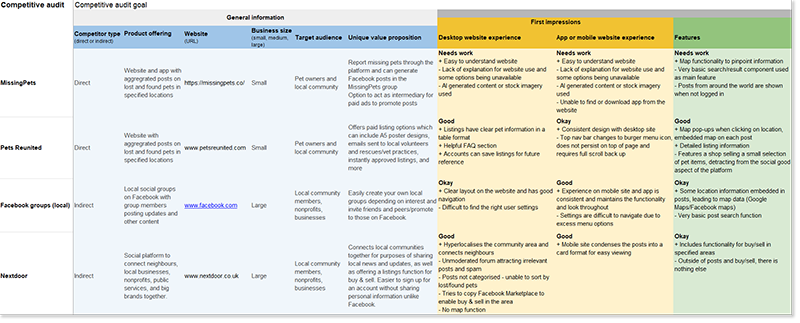
I found two direct and two indirect competitors to PetRecon offering identical services for owners of missing pets. The direct competitors featured a report and listing function, which was presented in a marketplace format with aggregated posts. The two indirect competitors had users creating posts and sharing in an online social media format for other users to view and interact with.
I made a competitive audit on the user experiences of each competitor, as well as their USPs, brand image and content:
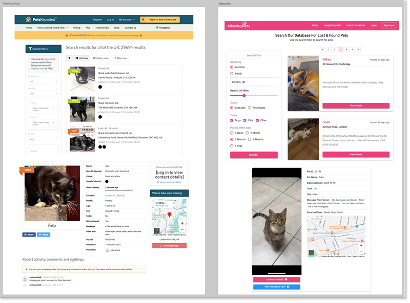
The following screenshots are key screens from the direct competitors, PetsReunited and MissingPets:
Storyboard
Once I understood the other missing pet platforms, I turned my focus to PetRecon’s user needs. To do this, I started by creating a user storyboard to get a better understanding of a typical scenario that would lead someone to PetRecon. A storyboard also helped me visualise pain points and motivations of the user.
Empathy map
I put together what I felt were the user’s feelings and thoughts into an empathy map, which I named Paula. I noted what they would say, think, do, and feel. This empathy map would then help me create a user persona that would serve as the typical user for PetRecon.
User persona
Through my research learnings, I created Violet, which gives me a more accurate representation of who I am designing for. Violet’s goals and frustrations directed my design choices throughout PetRecon’s creation.
Violet’s user story is:
As a pet owner who has previously lost and successfully found my own missing pet, I want to share and find key information with other pet owners in my local area about missing pets, so that others can quickly and easily recover their pets when these emergencies arise.
Define & Ideate
The next step was to begin establishing the core problems to be solved and the solutions that PetRecon would offer to be the most effective.
User journey map
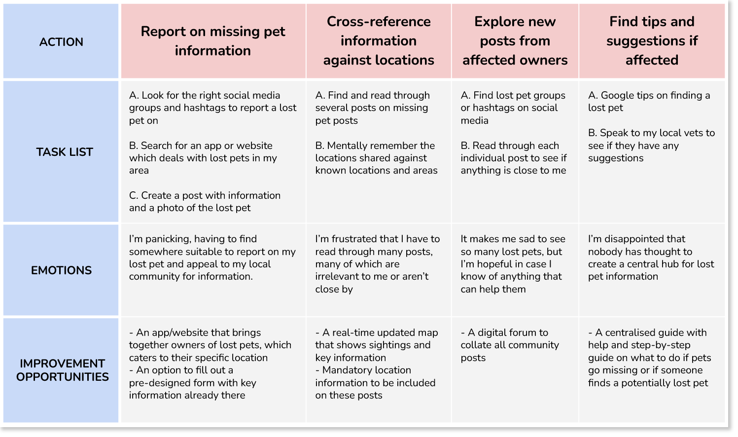
To start with, I created a user journey map illustrates Violet’s thought processes, behaviours, and emotions as she finds herself in a missing pet situation. For each action, I noted improvement opportunities that would alleviate the frustrations she may be having.
The following is the problem statement and goal statement for Violet, which stemmed from her user journey and experiences in my research.
Problem statement
Violet is a pet owner who needs to find and share lost pet information with her local community because she wants to help other pets owners, or to get help when pets go missing.
Goal statement
Our lost pet information platform, PetRecon, will let users share or report on lost pet information in the local area, which will affect owners of lost pets and neighbours in a local community by quickly reuniting lost pets safely back to their owners. We will measure effectiveness by recording the number of successfully reunited pets to their owners, which PetRecon helped with.
Information architecture
Site map
The following is the site map of PetRecon which I intended to be as minimal as possible. There were potential avenues for paid services within the platform, as seen on competitor sites, but PetRecon was intended as a non-profit platform, for social good, so I dismissed the ideas.
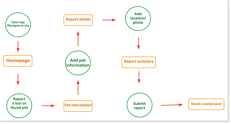
User flow
As with the site map, I wanted to make a streamlined user flow when using PetRecon. The main consideration I had in mind was that a missing pet situation causes a lot of stress for someone like Violet, so they would want to be able to quickly create a report without difficulty.
Lo-fi wireframes
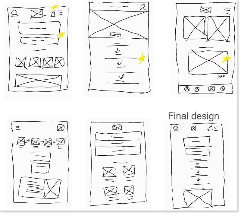
I drafted paper wireframes for the PetRecon app first, as I expected platform users to be mobile-first. I decided to make the responsive design for small screens as similar to the app design as possible for continuity reasons. Afterwards, I progressed to larger screen designs while being conscious of the information hierarchy as I edited component sizes and layouts.
App/Responsive (small screen) lo-fi paper wireframe examples
Responsive (large screen) lo-fi paper wireframe examples
Prototype & Test
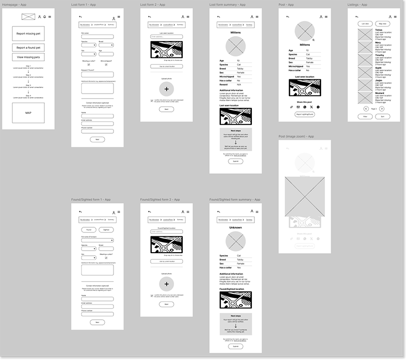
Next, I created lo-fi digital wireframes from the draft wireframes I drew and used learnings up to this point to make informed decisions about the design of the screens.
Lo-fi digital wireframes and prototype
With Violet’s user flow in mind, I created the main screens which included the homepage, report screens, and report listings. I paid close attention to the information architecture to ensure the options were top of the screen and that the report was easy to complete.
I created a variant of the report form that allowed users to report a sighting of a lost pet, which had different input fields and a slightly different report screen at the end of the process.
View the PetRecon lo-fi digital prototype here:
PetRecon lo-fi digital wireframes - App
PetRecon lo-fi digital wireframes - Responsive (Small screen)
PetRecon lo-fi digital wireframes - Responsive (Large screen)
Usability test
I conducted a usability test of the lo-fi prototype with several participants to get feedback from pet owners as non-pet owners who would serve as reporters of found/sighted pets in the local area.
5 participants
2 male, 3 female
3 that are pet owners, 2 that don’t have pets
Aged between 21-48
Test goals:
Test navigation and ease of use for report creation, listing browsing, and report searching
Accessibility issues and visual improvements that could be implemented
Whether PetRecon is useful and if it serves its purpose
Evaluate user performance and identify pain points
Tasks:
Navigate to the report creation page and create a report
Review the report form and share feedback
Find a lost pet report listing and review the search options
How easy was it to navigate the platform and were there any missing accessibility considerations?
I consolidated the usability test results into an affinity diagram to group findings and find common themes.
This helped me to identify priority changes and improvements before progressing to the high fidelity prototype, which led to the following key insights:
Users wanted better filter options in the search function
Users felt it would be beneficial to be able to contact the reporter directly, outside the platform
Users wanted an option to enlarge images, for accessibility needs
Style guide
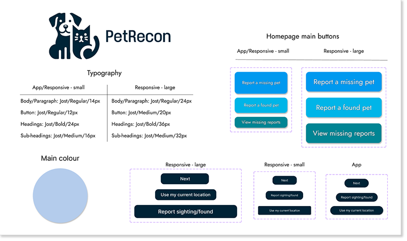
After several ideas for a brand name and logo, I eventually decided on PetRecon and used a simple dog & cat logo which I thought would be recognisable to users. I settled on various shades of blue as I thought it would be a calming visual factor as I expected the users of PetRecon to be stressed due to their situation.
Hi-fi wireframes and prototype
I created three hi-fi prototypes for each device variation using the user feedback I collated from the usability test and made additional improvements to the overall user experience.
The following are a few of the accessibility considerations I had when designing the hi-fi version:
The colour scheme and colour contrast conforms against the WCAG AA Compliance standards to ensure clear visibility for all users.
I used text hierarchy to help users understand the information priority of each screen throughout the platform. Borders and dividers also highlight the important sections.
Though not implemented, image zoom functionality has an icon for all applicable images. Text resize options is a requirement for the final design, regardless of device.
View the PetRecon (App) hi-fi digital prototype here.
View the PetRecon (Responsive - small screen) hi-fi digital prototype here.
View the PetRecon (Responsive - large screen) hi-fi digital prototype here.
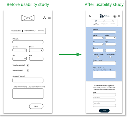
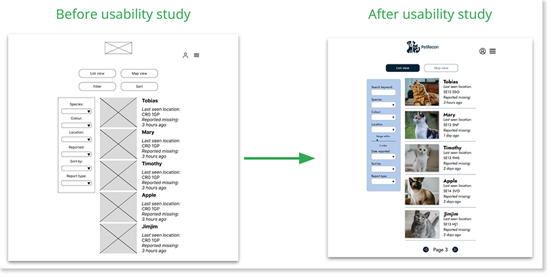
The following two examples show how I changed the design following user feedback in the usability tests:
Example 1: Framed form as main call-to-action, added optional contact form
Example 2: Additional search options, listings appear clearer due to added dividers
Review and next steps
In this last project of the Google UX Design Professional Certificate, I developed an app and responsive website for social good. My guiding principle from the beginning was to create a user experience that would be easy to use and navigate for the users. For a social good platform, I developed PetRecon’s UX with an emphasis on functionality and helping the user achieve their goals which aren’t materialistically related.
As PetRecon’s user base would be pet owners of all ages, the design is intentionally kept simplistic and straightforward to minimise confusion for those not tech-savvy. Thanks to the usability testing, I was able to improve upon my design and add various functionality to better serve users, which was a big plus.
Next steps
Given the chance to work on PetRecon further, I would focus on the following:
Hold another round of usability testing for the hi-fi prototype and continue improving future iterations
Improve upon the visual design and make the UI more aesthetically pleasing
Develop additional screens such as app/platform settings and epand on the navigation, with some testers having cited this as a potential area of improvement during usability testing

