TerrTerra - App
TerrTerra is a fictional camping supplies retailer looking to begin selling their products online. As part of their initial e-commerce plans, they wanted an app for their target audience to purchase their products from.
This is project 1 of the Google UX Design Professional Certificate.
̌
TerrTerra is a fictional camping supplies retailer looking to begin selling their products online. As part of their initial e-commerce plans, they wanted an app for their target audience to purchase their products from.
This is project 1 of the Google UX Design Professional Certificate.
My role
UX/UI design, user research, prototyping, usability testing
Duration
80 hours (December 2023 - April 2024)
Tools used
Figma, Adobe Photoshop, Google, Zoom
Project overview
Challenge
TerrTerra needed to start selling their products online, through a dedicated app and website. The first phase was to create a mobile app that stands out in the camping supply retailer industry.
Solution
Research the user requirements for potential camping supply buyers
Create an e-commerce app that meets the needs of the target audience
Design process
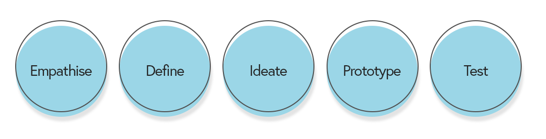
Empathise
Research
The first step was to define my research plan to gain a deeper understanding of the market and TerrTerra’s potential customers. I set clear research goals to guide the process:
Identify TerrTerra’s competitors and assess their web/app offerings
Evaluate the market using SWOT and a competitive audit report
Identify TerrTerra’s target audience
Understand potential users’ experiences with similar online retailer platforms
Discover pain points of these experiences and what their needs are
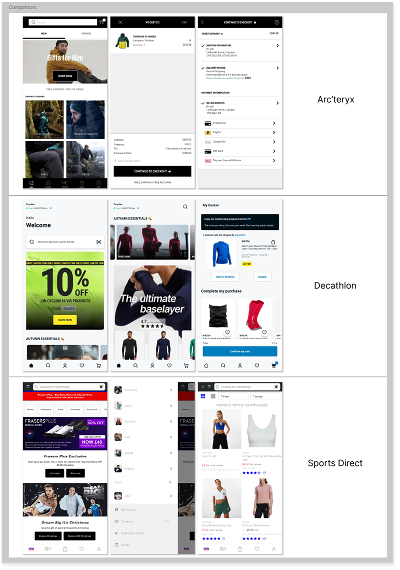
Competitive analysis
I began by researching TerrTerra’s direct and indirect competitors to evaluate what they offer and the strengths/weaknesses of each brand. This helps me to build on their strengths and avoid their weaknesses when I begin designing TerrTerra’s app.
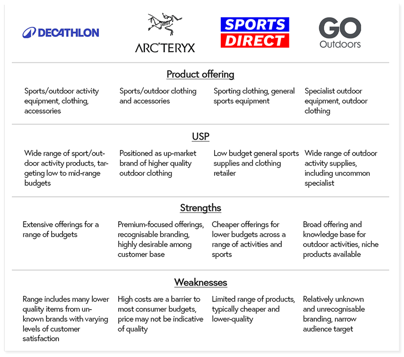
I then downloaded competitor apps and screenshotted key screens to add to my moodboard screen as part of the design inspiration.
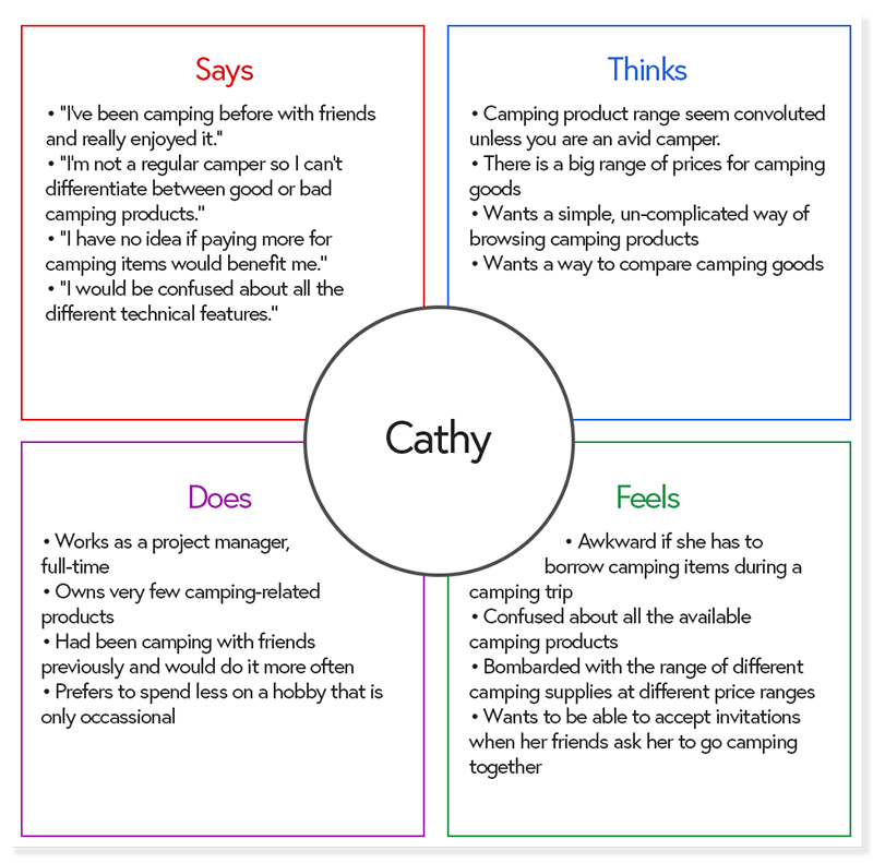
Empathy map
Moving onto user research, I then conducted a user interview to distil a typical user’s thoughts, feelings, and traits about purchasing camping supplies. From this, I created a one-user empathy map to helped me understand and prioritise the app user’s needs for TerrTerra.
Some questions I asked during the interview:
Have you been camping before? Did you enjoy it?
Tell me about your experience with buying sports/outdoor products online or through app.
Which brands or retailers would you consider when buying camping goods?
Do you find it difficult to choose what to buy before a camping trip?
Would you be willing to pay more for higher quality camping products?
User persona
Through my research, I gained a clearer picture of TerrTerra’s target audience and created a persona, Karla, to accurately represent their needs and frustrations. Karla guided my design decisions and helped me focus on aspects that would meet her goals and reduce her frustrations.

Define & Ideate
Once I had my user persona for TerrTerra, I went about identifying the main problems that need to be addressed, as well as any needs that should be met with TerrTerra’s app.
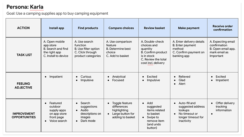
User journey map
I created a user journey map to better understand Karla’s experience as she uses an app to browse and purchase camping supplies. This helped me think and feel like Karla, which in turn shaped my design choices.
I merged these insights I gained from my empathy maps, user persona, and user journey map to define a focused scope for my designs. To this end, I came up with a problem statement and a goal statement for Karla.
Problem statement
Karla is an outgoing artist who needs more information on which camping supplies to buy because she is fairly new to camping and would like to purchase suitable camping equipment.
Goal statement
The TerrTerra app will let users find the right camping products for them, which will affect those new to camping by presenting product information in a succinct manner and letting them compare products to better inform their purchasing decision. I will measure effectiveness through customer ratings and reviews of the app.
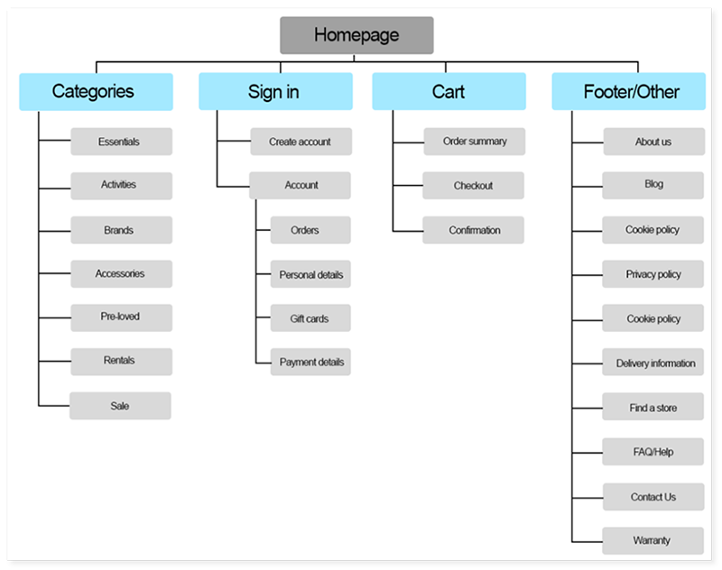
Information architecture
Site map
I created an initial site map to define the structure of TerrTerra’s content, making it as easy as possible for Karla to navigate.
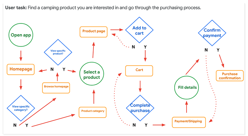
User flow
To empathise with Karla as she uses the TerrTerra app, I made a user flow to understand her purchasing journey and see how she makes decisions during her experience.
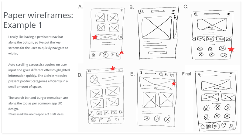
Lo-fi wireframes
Building on all the research and data collected, I designed and drafted the TerrTerra app wireframes.
An example of the app’s homescreen with design notes is shown below:
Prototype & Test
The next step was to create digital wireframes from these initial sketches, bringing me to a point where I can begin testing the design with real users and gain valuable feedback from them.
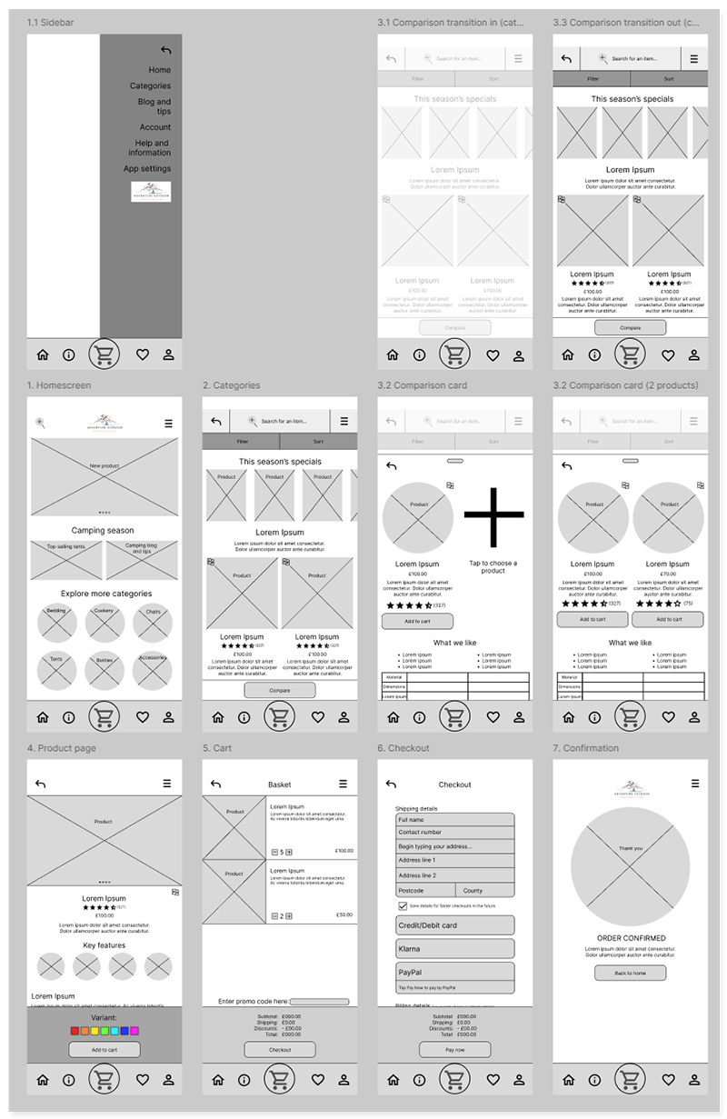
Lo-fi digital wireframe and prototype
I focused on designing the screens for the main user flow as part of this project; this includes all screens mentioned in Karla’s user flow.
For this prototype, I also created the screens and animations for the product compare function, as I felt it was necessary to get user feedback on this as early as possible before creating it in the hi-fi version of my design.
Usability test
Once my prototype was completed, I conducted testing with participants to see how my design fared with real users.
5 participants with an active lifestyle
2 male, 3 female
1 of which requires accessibility issues due to visual impairment
2 of which are not natively fluent in English
Aged between 25-45
Test goals:
Gather feedback on the comparison feature and whether it helped purchase decisions
Ease of use for browsing, adding a product to cart, purchase process, expected outcomes
Evaluate user performance and identify pain points
Tasks:
Navigate from the home screen to a product category, then to a product of your choice
Compare this product with any other product
Add the product to cart and complete the checkout process
Return to the home screen and find information on camping tips
Once I gathered the results, I generated an affinity map to gather and synthesize my findings from the user testing.

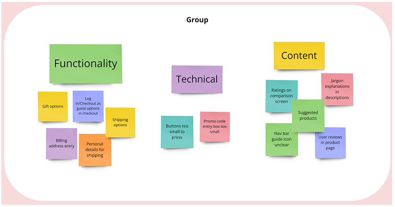

This helped me draw connections between similar feedback, which led to the following key insights.
Users want to see product suggestions and buyer ratings/reviews
Users want additional options during the checkout process, including checkout as guest functionality
Users found visuals unclear, which they felt would affect accessibility
From this, I would be able to evaluate the priorities on design changes when progressing to the high-fidelity design.
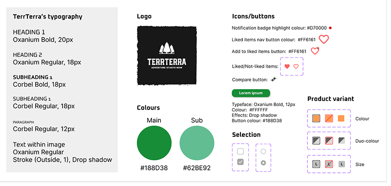
Style guide
I came up with the name TerrTerra, based on the latin word for “earth” and short brand tagline “Adventure starts now”. I created a style guide based on the market research and analysing common visual themes in the industry. I then applied these UI elements to the hi-fi design.
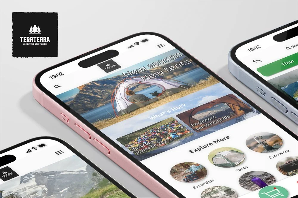
Hi-fi wireframes and prototype
With these visual guidelines and user feedback in mind, I worked on the high-fidelity versions. I designed additional screens as a proof of concept to understand how other parts of the app would look and work. I spent a lot of time working on the design and choosing the right (high-fidelity) visual elements that would best match the TerrTerra brand that I had in mind, as well as building on the considerations from user testing feedback and the intended end user.
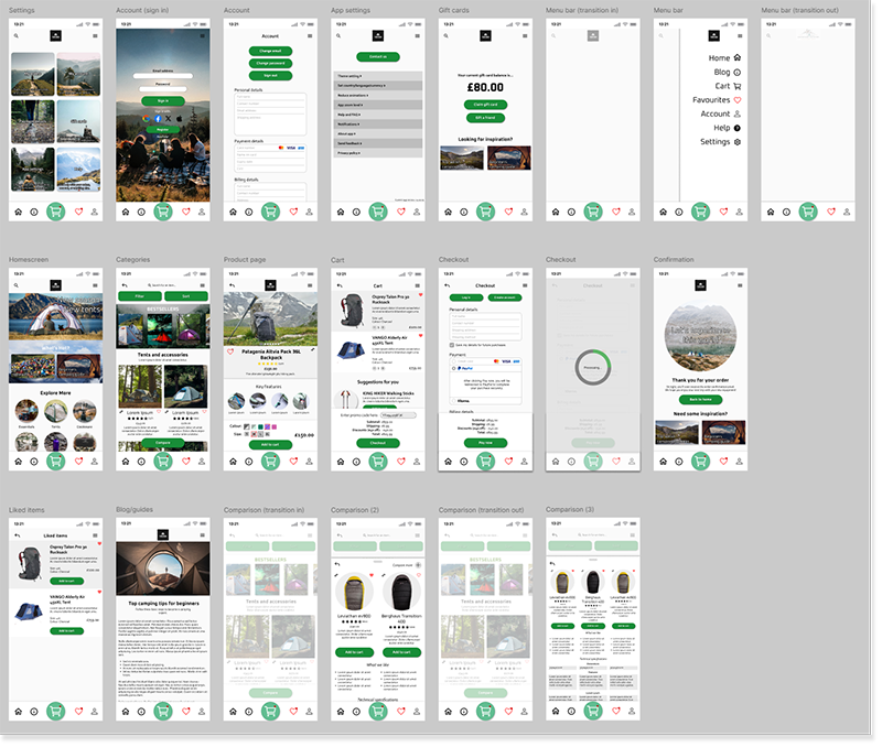
I made additional updates to various UX aspects as I was developing the design, both from user feedback and personal choices. Below are two examples:

Example 1: Product suggestions added to the cart screen

Example 2: Additional option in comparison card popup
Review and next steps
In my first project in this Google UX Design Professional Certificate, I learned a great deal about the research and design process, and putting user needs at the centre of TerrTerra’s UX design throughout the project. I especially enjoyed the visual design aspect and, although I have limited design experience, I’d really like to get involved in the visual design aspect of UX design in the future.
Towards the end of the high fidelity design, I invited a friend, who is currently working as a UX researcher in the industry, to give her thoughts on my overall project research and hi-fi prototype usability. This gave me a lot of useful insight from someone who has experience in UX, and I was very thankful for the feedback I received.
Next steps
As for the next steps, if I were to advance this project further, I would do the following:
Make further adjustments to the content and visuals; e.g. incorporate the beginner tips into the product screens and settings screen layout changes.
Develop further accessibility options to suit a wider range of user needs, including colour variants, content element and text size modifier, image-to-text descriptions.
Create UX screens and elements for an AI chatbot to further meet user needs and help them understand what to buy, terminology, and suitable products, etc.
